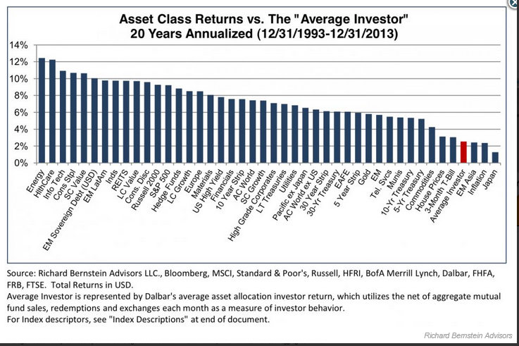
Thanks to The Big Picture and Value Walk for bringing this chart to my attention that was included in a recent Seth Klarman note. Asset Class Returns vs the Average Investor I’m not sure what most investors are doing with their investments, but it isn’t pretty. In the above chart, it displays the annualized return over the past twenty years by asset class. Farthest left is Energy which average just over 12% return per year for 20 years, and all the way to the right is Japan with a dismal 20 year return. But look at where the...
